Barcelona Hiking Guides
Redesign of a guided hiking website so comparing, trusting, and booking felt clearer.
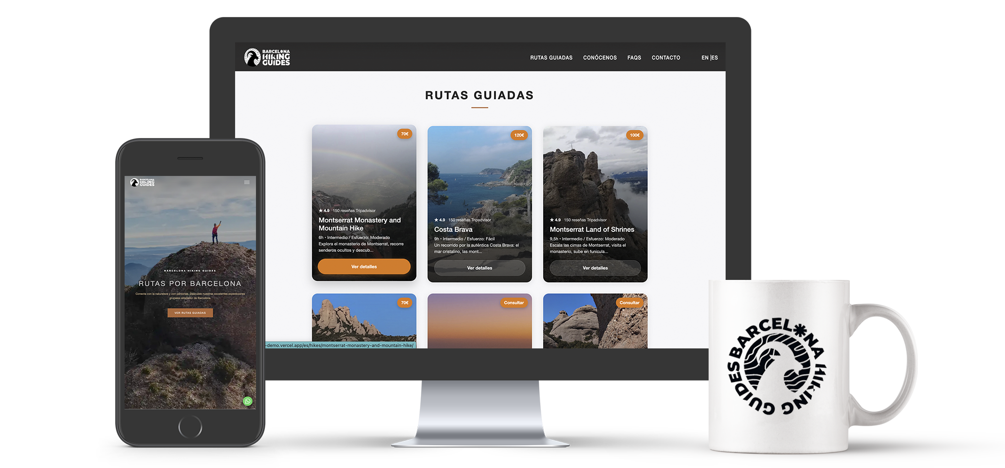
Less explanation, more intent: every decision moves the user toward a clearer choice.
Problems vs solutions
The redesign focused on concrete decisions.
Before designing screens, I defined what was blocking the choice and what each part of the experience had to solve.
Choosing required reconstructing the offer
Problem
Price, duration, difficulty, and type of experience were not readable together.
Solution
Design the homepage as a comparison layer, not as a showcase.
The next step did not support the reading flow
Problem
Users could decide halfway through the page and still have to search for how to book.
Solution
Bring booking closer to the moment of intent on desktop and mobile.
Doubts appeared before commitment
Problem
Physical level, group setup, guide quality, and route reality could block the decision.
Solution
Show visual proof, reasons to trust, and direct contact.
The problem
The offer was good. The decision required too much effort.
To choose a route, users had to mentally combine price, duration, difficulty, scenery, and trust in the guide. The previous website inspired, but it did not turn that inspiration into clear comparison.
Comparison
Routes appeared one after another, not as options that could be evaluated at the same time.
Decision
Users could become interested in a route, but the next action was not integrated into the reading flow.
Trust
The experience relied on photos and context, but those signals did not always resolve concrete doubts.
The opportunity was not to add more information, but to place the right information at the right moment.
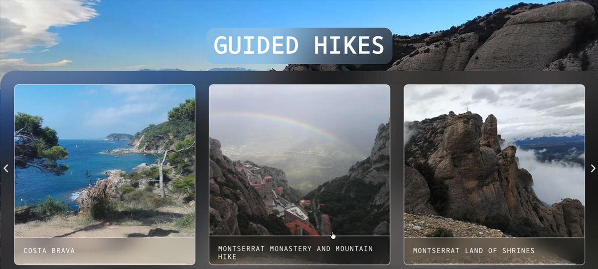
Before
The information appeared as a sequence of cards: visual, but difficult to compare at a glance.
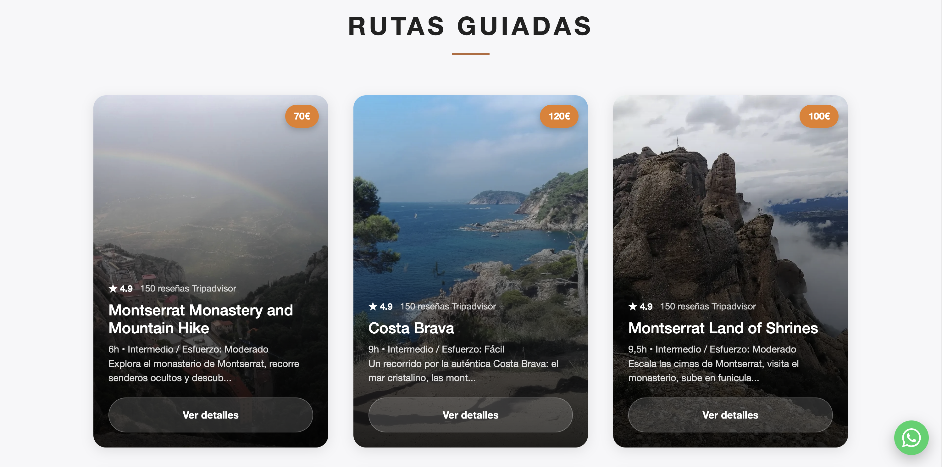
Now
Routes read as comparable options, with key data and action visible on the same surface.
UX strategy
Three product changes.
The solution came down to three moves: compare earlier, decide with fewer doubts, and keep the action close.
Comparison-based homepage
Routes are shown as comparable options, not as isolated links.
Clear route page
Each page answers quickly: what it is, how demanding it is, how much it costs, and how to book.
Visible trust
WhatsApp, the trust section, and real galleries reduce uncertainty before payment.
The key decision
Turn the home page into a comparison layer that makes decisions easier and brings users closer to booking.
Users do not arrive to read everything. They arrive to quickly understand their options and see which hike best fits their time, level, and budget. When that comparison happens clearly from the first screen, the experience reduces friction and moves purchase intent closer to booking.
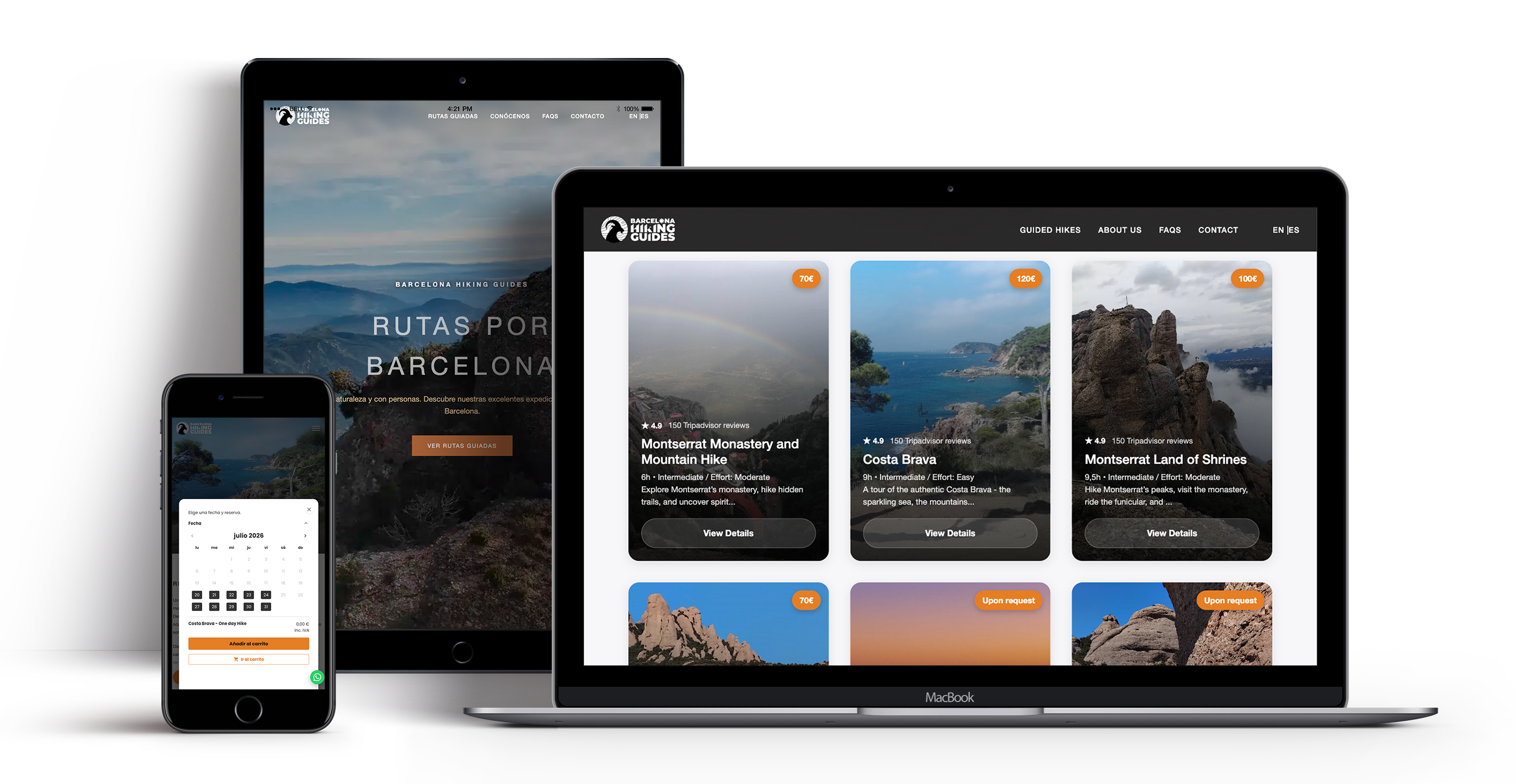
Scanning
Several hikes can be understood in a single view.
Key data
Price, duration, and difficulty appear before the detail page.
Clear action
The button turns interest into a visible next action that feels easier to book.
Less memory load
Comparison happens on screen, not in the visitor's head.
Natural entry
Anyone needing more context can enter the route page.
Route page
A page designed for decision-making.
The page stops being only descriptive. It organizes the experience like a considered purchase: context, value, data, trust, and booking.
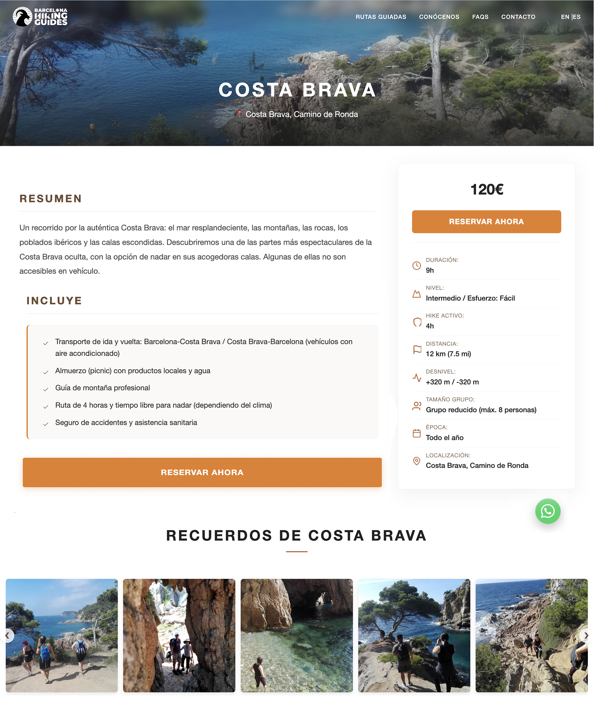
Context
Destination, imagery, and route promise.
Evaluation
Duration, difficulty, distance, and group setup.
Booking
The action stays available while reading.
Doubts
WhatsApp supports the moment of uncertainty.
Evidence
Real galleries help people imagine the experience.
Design decisions
What really changed.
Less explanation, more intent: every decision moves the user toward a clearer choice.
Compare earlier
Key data moves into the first view so people can decide without opening everything.
Book closer
The action accompanies the reading when intent appears.
Trust by seeing
Real photos, quick help, and brand signals reduce doubts.
Grow more easily
Structured content and reusable components support new routes.
Web development and SEO
A light foundation for a content product.
Astro allows fast, maintainable pages. Route-based content prepares the site for specific searches without turning it into a rigid template.
Separated content
Texts, data, and images for each route live outside the template.
Reusable components
Cards, galleries, and route sheets keep the experience consistent.
Route pages
Each experience can rank by destination and search intent.
Optimized images
WebP and lazy loading help on a highly visual site.
Outcome
From an informational website to one that sells better.
By reducing friction when comparing hikes, bringing booking closer to the decision point, and making trust visible, the experience stops acting like a brochure and starts actively supporting sales. That is the real shift: more intent turned into bookings and a website that works harder for the business.