01
Why private groups?
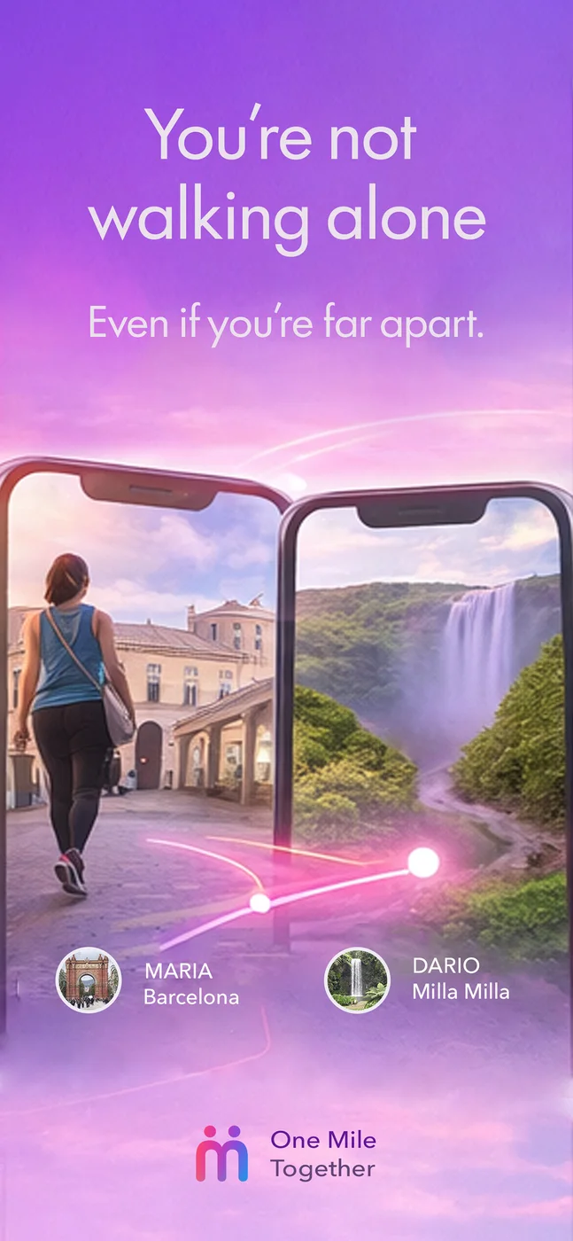
Because the strongest motivation was not competing with strangers. It was staying close to the people who matter. Private groups turn the habit into real companionship.
Most activity apps are built around performance, pressure, and progression. But many people drop off because walking stops feeling human and starts feeling like another obligation.
One Mile Together started from a much simpler idea: what if walking one mile a day could become a way to stay close to people who are far away?
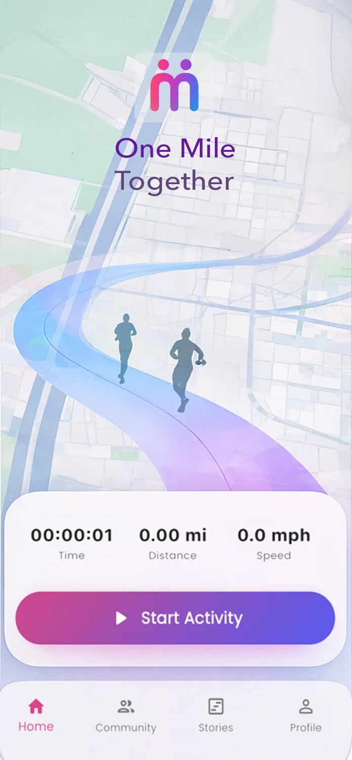
Most fitness products motivate through performance. One Mile Together wanted to motivate through people. That single shift defined the concept, the onboarding, the group mechanics, and the tone of the entire product.
The starting point was not technology. It was understanding why so many wellbeing habits break even when the initial intention is positive.
The key move was stepping away from sports logic and reframing walking as a small but shared daily ritual.
The visual identity had to feel warm, light, and human, moving away from the aggressive language typical of fitness brands.
The product was designed to be understood quickly: join, walk, share, and return to the group without friction or overload.
The project did not end with the app. It also needed to be packaged, explained, and brought to market with clarity.
It was not enough to explain what the app did. The case study needed to explain why the experience was designed that way in order to sustain the habit through relationships instead of pressure.
Because the strongest motivation was not competing with strangers. It was staying close to the people who matter. Private groups turn the habit into real companionship.
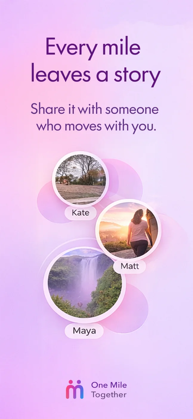
Because consistency needed a goal that anyone could start today. One mile is not powerful because it is hard. It works because it makes tomorrow possible.
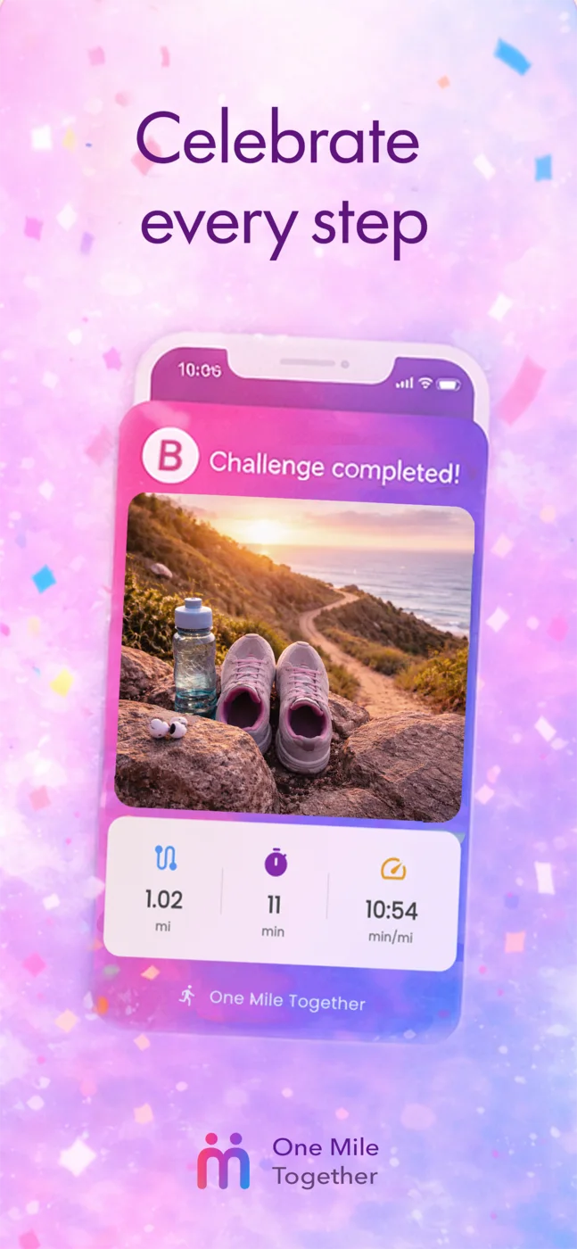
Because after the close circle comes a second layer of belonging. Community opens discovery, routes, and like-minded people without losing the human tone of the product.
A clear product thesis: transform a daily walk into a social, emotional, and repeatable shared ritual.
Flows, hierarchy, and screens designed for easy entry, understandable progress, and ongoing social reinforcement.
A warm, clean, adaptable identity that moves the product away from aggressive sports language and closer to human connection.
A promotional site built to explain the concept in seconds, communicate tone, and direct users to the stores.
Visuals, screenshots, and listing narrative for App Store and Google Play aligned with the real value of the product.
Release in ES and EN with a consistent story, public presence, and distribution through App Store and Google Play.
Rather than building another walking tracker, the project explored how design could transform a solitary habit into a shared daily ritual.
Every decision, from the one-mile goal to the private groups, was intended to make consistency feel social rather than demanding.
The idea was emotional, but the experience still depended on concrete technical decisions: usable tracking, reasonable battery behavior, solid performance, and resilience on the move.
Retention through Social Bonding
The problem: Traditional fitness applications suffer from high churn rates due to entry barriers based on performance and intensity (e.g. running 10 km).
The solution: The metric goal was reduced to a minimum (1 mile), shifting the product's weight to the shared experience. By creating a system of closed groups and real-time social notifications, the user does not walk strictly for sport, but rather walks to interact and send a progress ping to their circle of trust.
GPS Accuracy vs Battery Performance
The problem: Tracking walks in the background severely drains battery life, causing users to uninstall the app. Background tracking is also strictly blocked by aggressive OS policies on iOS and Android.
The solution: Advanced integration of device sensors using Flutter (`geolocator` and Activity Recognition API). The polling rate was adjusted conditionally to the user's velocity, massively optimizing GPS reads without losing the path trace mapped over Google Maps.
UX Performance & Cloud Savings
The problem: High-resolution photos drain users' mobile data, cause slow loading times on outdoor networks, and exponentially increase cloud storage costs for the business.
The solution: Native on-device compression reduces file sizes by up to 80% before uploading, ensuring near-instant uploads while drastically cutting server costs. This is paired with a local cache system: photos load straight from the phone's memory, bypassing unnecessary network requests and significantly improving UX.
GPS Tracking without Internet
The problem: Walking through remote zones or mountain trails often results in cellular network loss, traditionally corrupting tracking progress and frustrating users.
The solution: Offline-first architecture for tracking sessions. The app relies on pure GPS hardware when coverage drops, caching all route data locally. Furthermore, the entire activity card (along with its photo, information, and metrics) is safely stored on the device. Once the network returns, the system silently synchronizes in the background, publishing the activity without data loss and flawlessly recalculating the map route.
End-to-end product design and development for apps, platforms, and digital rollouts.
appdevoka@gmail.com